
A few days back. It was announced by Ashwin. You missed it ?since when you became a Team member?
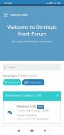
SFF 2.0
- Thread starter Avi
- Start date
You are using an out of date browser. It may not display this or other websites correctly.
You should upgrade or use an alternative browser.
You should upgrade or use an alternative browser.

Can you stop two posts merging into one. Even after an interval of 3 hours, I've seen it happening on a thread if the poster is the same & nobody else has posted anything in the interim. It's very annoying as two disparate posts with little or no connection whatsoever gets merged creating incoherence in the minds of the readers.
@Ashwin ; @nair
@Ashwin ; @nair
In tactical theme, bright colours like yellow and orange box are too bright..
Please reduce that brightness..
Meanwhile i checked mere and vanilla..
Mere is pleasing to eye, without bright opposing coloured boxes..
Vanilla is basic simple..
Between right top corner, preferences selecting box is placed in left side in tactical theme..
For color comparison, I took screen shot of all 3.
Attachments
Account box in tactical theme is located differently..
-------------
We can have a poll at the end for the 3 themes.. And make the winner as default theme..
--------------
How to insert images here instead of bottom
--------------
I missed it..
Congratulations..
In version 2.
-------------
We can have a poll at the end for the 3 themes.. And make the winner as default theme..
--------------
How to insert images here instead of bottom
--------------
A few days back. It was announced by Ashwin. You missed it ?
I missed it..
Congratulations..
In version 2.
Attachments


Last edited:
Damn each style is has plus and minus.. Not able to decide which one to select..
Again taken 3 screen shots of same page for comparison..
-----------
Even though tactical has dark background, colour boxes are too bright taking away the dark background advantage.
I think as on today, I would select mere..
Again taken 3 screen shots of same page for comparison..
-----------
Even though tactical has dark background, colour boxes are too bright taking away the dark background advantage.
I think as on today, I would select mere..
Attachments

Last edited:
I have a suggestion.... Moring 1, Afternoon 1 Evening 1......Damn each style is has plus and minus.. Not able to decide which one to select..
Again taken 3 screen shots of same page for comparison..
Go for a toss. Best of 3.Damn each style is has plus and minus.. Not able to decide which one to select..
Again taken 3 screen shots of same page for comparison..
-----------
Even though tactical has dark background, colour boxes are too bright taking away the dark background advantage.
I think as on today, I would select mere..
Damn each style is has plus and minus.. Not able to decide which one to select..
Again taken 3 screen shots of same page for comparison..
-----------
Even though tactical has dark background, colour boxes are too bright taking away the dark background advantage.
I think as on today, I would select mere..
I chose Vanilla for now. But if they fix the banner problem, then I'll go for Mere.
I think they staff members here should incentivise seeking formats other than vanilla . Don't you agree?I chose Vanilla for now. But if they fix the banner problem, then I'll go for Mere.
Guys need feedback
@Jat_Ke_That @ni8mare @Gautam @_Anonymous_ @Paro @screambowl @lingesh92 @Falcon @Sathya @BlackOpsIndia @vstol Jockey @randomradio @Saaho @RISING SUN @Ginvincible @Avi @nair @suryakiran @Milspec @Parthu
View attachment 15505
(If you are not seeing this select the theme 'TACTICAL')
This is a total rework according to feedback. Users who feel 'its too black', give it a few days to get adjusted (Or you can choose from a light theme). Color pallet variations will be available at a later stage. The background image is also customizable.
I like the tactical theme, it is easy to look at and makes a good "night mode". Having the option to make it a light mode is really nice for those who prefer it
")
The page does feel longer but I don't personally mind it. Perhaps reducing the width of the forum list and adding a sidebar for chat/common tools (or whatever you want to experiment with) would help with while also adding some functionality. The only issue is that it carries the risk of making the main forum page too cluttered.
I think they staff members here should incentivise seeking formats other than vanilla . Don't you agree?
In what way?
I don't know. Cash, I guess. What do you suggest?In what way?
Look at it in this way. If everyone utilizes the same format, the staff here would feel like dunces for effecting such a change , paying for it & what's more spending their precious time. Granted there's nothing better to do & work at home isn't a 9-5 affair. Yet...
Dont have any hope of parkirama, I guess he has left forum and other social media for ever,Now that Avi has come back,
Hope Parikrama also get in.. Soon.
Dont have any hope of parkirama, I guess he has left forum and other social media for ever,
Thats a sad & shocking news.
I wish him good , happy & prosperous life.
My son decided that all those SM platforms I frequent viz WA & Strategic Front needed a face .
Nah ... we were so used to that DP
I prefer MAD magazine cover as my dp.Nah ... we were so used to that DP
"Notification > Show all" Gives error. Here is the error message
"An unexpected error occurred. Please try again later"
"An unexpected error occurred. Please try again later"
We are aware of this, the upgrade is not completed yet, once 100% is done this issue will be addressed"Notification > Show all" Gives error. Here is the error message
"An unexpected error occurred. Please try again later"